If we’re honest, a lot of police department social media graphics look like they were made in 2003 on a computer that’s been there since before you got hired. That’s not to say you don’t try your hardest, but let’s be real. When you took that oath, “graphic designer” wasn’t really what you had in mind in the pursuit of crime-fighting justice. But, at the end of the day, your social media graphics are part of your public image. They speak for you before anyone reads the caption.
Here are five mistakes I see all the time, with real examples, and how to fix them.
(P.S. If a graphic looks familiar, don’t worry, I blurred the evidence. This isn’t about calling you out. You’re literally a police officer trying your best, not a trained graphic designer.)
1. Blurry or Low-Quality Images
Badges, photos, or logos that are fuzzy or stretched can make a post look rushed. People may not say anything, but they do notice.

Fix: Start with high-resolution images whenever possible. Crop instead of stretching, and always pull from the corner when resizing, not the top/bottom or left/right. Also, if your logo isn’t crisp, ask the original designer for a clean version or have one remade.
2. Too Much Going On
When there are too many elements competing for attention, nothing really stands out. Overcrowded graphics can make the main message harder to find.
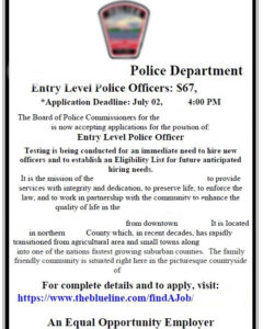
Fix: Strip it down to the essentials. Let the headline grab attention and keep the rest of the details in simple bullet points, in the caption or on a linked page.
3. Graphics That Don’t Match Your Community
Using visuals that don’t reflect your area — like a mountain pass for a road closure in rural Illinois — can feel generic and disconnected.
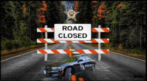
Fix: Use visuals that reflect your community. If it’s farmland, use a local farm photo. If you’re talking about a parking ordinance in your downtown, use a shot from your actual streets. People connect with places and things they recognize.
4. Confusing or “Cop Talk” Language
Acronyms, internal terms, and military time can be second nature to us, but unfamiliar to the public. If they have to stop and translate, they may move on.
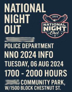
Fix: Write like you’re speaking to a neighbor. Swap “CID” for “detectives,” “NIBRS” for “crime stats,” and use standard AM/PM time.
5. Poor Visual Hierarchy
When all text is the same size and weight, it’s harder for people to know where to start reading. Multiple points on one graphic confuses readers.

Fix: Decide what’s most important like a main message, headline, date, or location. Then make that the first thing the eye goes to. Use size, placement, and color to guide the reader’s attention.
The Bottom Line
Your posts are part of your public image. A clear, polished design makes it easier for your community to get the information they need — and makes your department look organized, professional, and approachable. The good news? Small design improvements can make a big difference.